Recently, the newest version of the popular ggplot2 graphics package was announced, and it has some nifty mapping features that I was keen to try out (read more here). Mainly, I was interested in the support for sf, or “simple features”, objects. This class of objects were created as part of a wider R package designed to make mapping and spatial analyses far easier.
The latest update of ggplot2 not only makes plotting from sf objects trivial, but also means that some quite nice map figures can be made with relatively little effort, as you’ll hopefully see below.
# first you'll need to update your version of ggplot to the latest version
# install.packages("ggplot2")
library(ggplot2)

# now lets load some other packages that we'll need to load and manipulate
# spatial data in R
library(mapdata)
library(sf)
library(lwgeom)
Assuming you managed to get those packages installed and loaded ok (if you didn’t, you almost certainly have encountered some dependency issues), we can now start playing with some data. To begin, let’s load a world map to play with.
mapBase <- map("worldHires", fill = T, plot = F)

# now we need to coerce it to an "sf" object, and fix any
mapBase <- st_as_sf(mapBase)
# now let's try cropping it to a region of Europe
cropMap <- st_crop(mapBase, xmin = -15, xmax = 30, ymin = 30, ymax = 60)
# note we get an error message about Self-intersection...# we can fix this using the lwgeom library...
mapBase <- st_make_valid(mapBase)
cropMap <- st_crop(mapBase, xmin = -15, xmax = 30, ymin = 30, ymax = 60)## Warning in st_is_longlat(x): bounding box has potentially an invalid value
## range for longlat data## although coordinates are longitude/latitude, st_intersection assumes that they are planar## Warning: attribute variables are assumed to be spatially constant
## throughout all geometries# now it works fine...Now that we have a valid sf object to plot, we can start using the geom_sf function to start making some nice maps.
# basic map to start with
ggplot(cropMap) + geom_sf()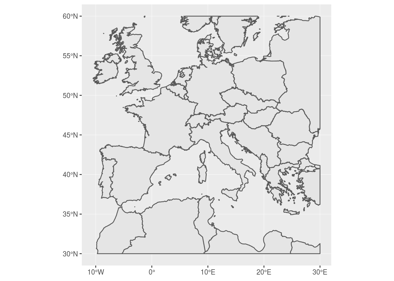
Cool right? Notice a few neat things? Firstly, ggplot draws a nice graticule for you, complete with the correct “degrees” symbol and N, S, E, or W to denote the correct hemisphere. Secondly, go ahead and resize the map… What do you notice? Hopefully, you’ll see that the aspect ratio of the map has been fixed so that your map always projects correctly. This is a great feature and saves you some time faffing around trying to manually correct the aspect ratio.
Having explored some basic features, we can now start to tailor our map and add features to it using other packages, or data.
# let's say we want to highlight the location of Spain, clarify the axes,
# and remove those annoying grid lines
spainMap <- ggplot(cropMap,
    aes(fill = factor(ifelse(cropMap$ID == "Spain", 1, 2)))) +
  geom_sf() +
  labs(x = "Longitude", y = "Latitude", fill = "") +
  scale_fill_manual(values = c("darkgrey", "lightgrey"),
    labels = c("Spain", "Not Spain")) +
  theme_bw() +
  theme(panel.grid = element_line(colour = "transparent"),
    axis.title = element_text(size = 18),
    axis.text = element_text(size = 16),
    legend.text = element_text(size = 14),
    legend.title = element_text(size = 14))

spainMap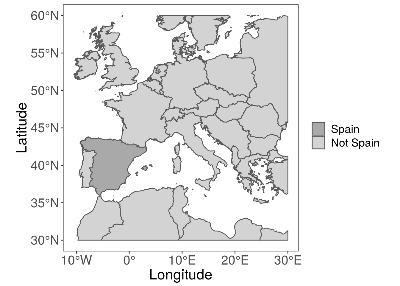
Pretty easy so far right? But what if we want to add some points to the map, for example to highlight sampling locations? Well, this is really easy too!
# simulate some random coordinates within the limits of our map
locations <- data.frame(lat = runif(25, 30, 60), long = runif(25, -15, 30))

# now convert this dataframe into an sf dataframe
sfPoints <- st_as_sf(locations, coords = c("long", "lat"), crs = 4326)

# and simply add another geom_sf layer to the plot to include the points
pointsMap <- ggplot() +
  geom_sf(data = cropMap,
    aes(fill = factor(ifelse(cropMap$ID == "Spain", 1, 2)))) +
  geom_sf(data = sfPoints, col = "red", size = 3) +
  labs(x = "Longitude", y = "Latitude", fill = "") +
  scale_fill_manual(values = c("darkgrey", "lightgrey"),
    labels = c("Spain", "Not Spain")) +
  theme_bw() +
  theme(panel.grid = element_line(colour = "transparent"),
    axis.title = element_text(size = 18),
    axis.text = element_text(size = 16),
    legend.text = element_text(size = 14),
    legend.title = element_text(size = 14))

pointsMap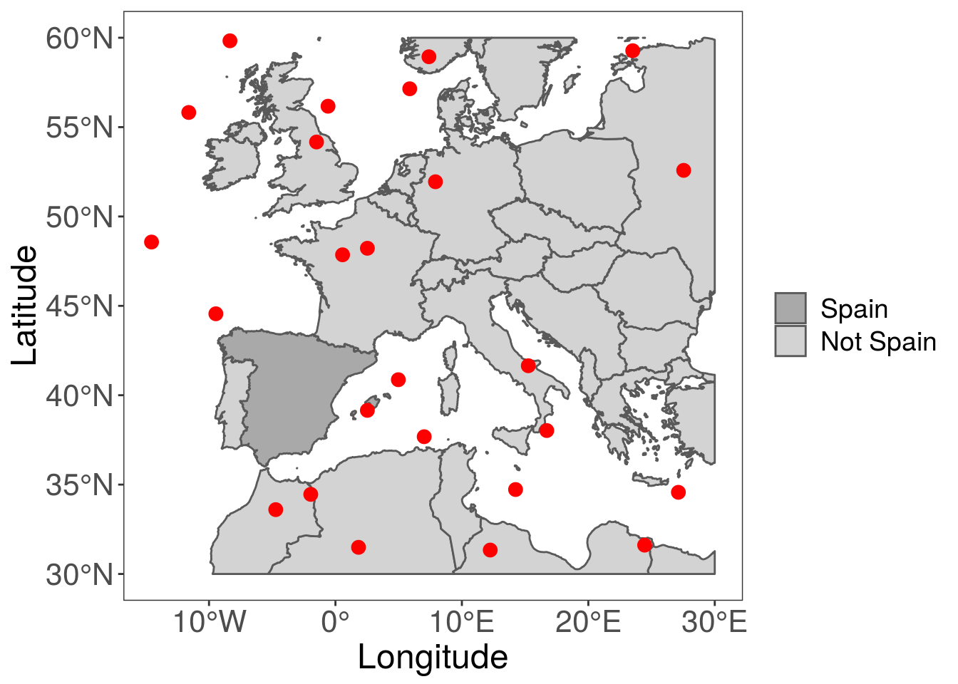
Again, super simple. Now, I’d like to create a smaller map, that just shows Spain and any points inside it, so I can make a nice panel figure with the two maps side by side. Also, don’t forget a scale bar, which we can add using the ggspatial package.
library(ggspatial)

# work out which points are in the polygon of interest
spainPoints <- st_join(sfPoints, cropMap[cropMap$ID == "Spain", ],
  join = st_intersects)
## although coordinates are longitude/latitude, st_intersects assumes that they are planar
## although coordinates are longitude/latitude, st_intersects assumes that they are planarspainZoom <- ggplot() +
geom_sf(data = cropMap[cropMap$ID == "Spain", ]) +
annotation_scale(location = "br", text_cex = 2) +
geom_sf(data = spainPoints[spainPoints$ID == "Spain", ], colour = "red",
size = 3) +
theme_void() +
theme(panel.grid = element_line(colour = "transparent"))
spainZoom## Scale on map varies by more than 10%, scale bar may be inaccurate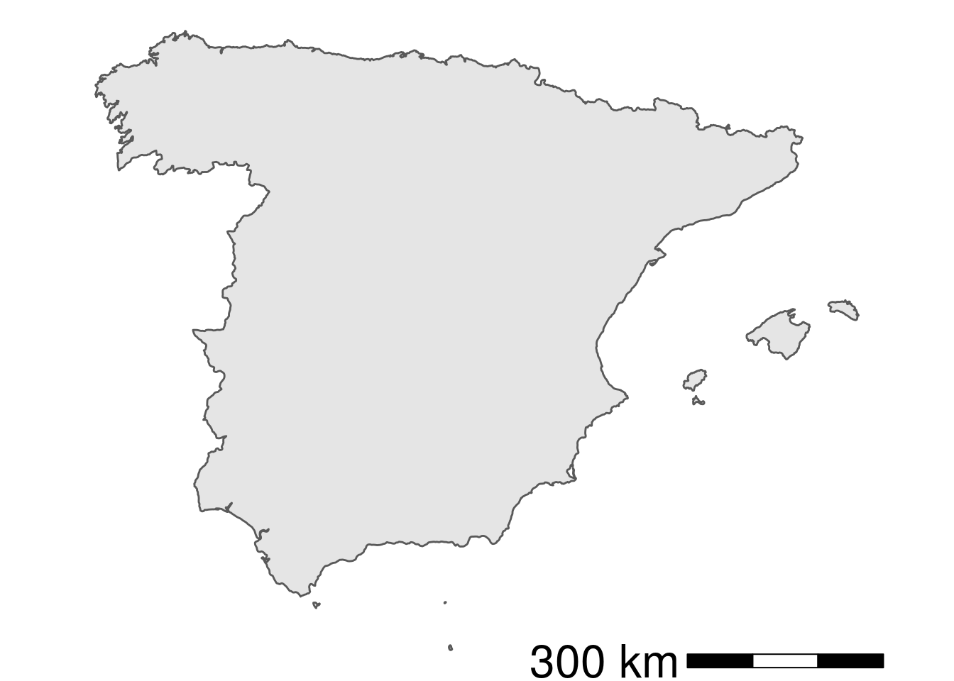
So, now we have our two maps sorted, we can arrange them side by side using the cowplot package.
library(cowplot)##
## Attaching package: 'cowplot'## The following object is masked from 'package:ggplot2':
##
## ggsaveplot_grid(spainZoom, pointsMap, labels = "AUTO", rel_widths = c(0.6, 1))## Scale on map varies by more than 10%, scale bar may be inaccurate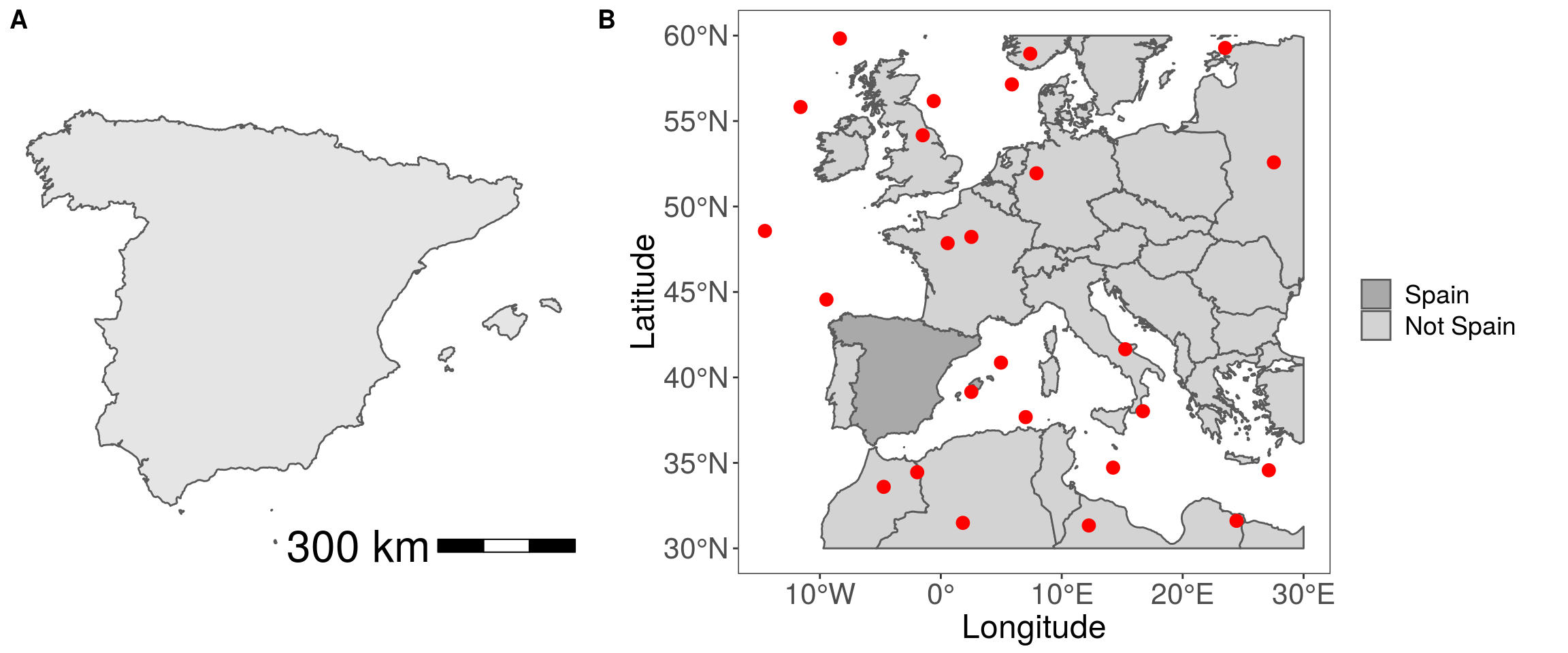
There you have it, combining the sf and newest ggplot2 packages allows you quickly and easily make some neat looking map figures!