If you use R to analyse and plot your data, then you’ve probably heard of and used the ggplot2 package, written by Hadley Wickham. ggplot2 is a highly flexible plotting package allowing you to create just about any kind of plot you can think of, and customise just about any aspect of your plot.
However, ggplot2 is also known for it’s somewhat strange choice of default options (at least, they seem strange to me!). Therefore, it can seem like a lot of work to go from a basic plot to something that is approaching publication quality. Whilst there are many excellent guides out there to help with this process, I thought I’d weigh in with a few tips and personal preferences which have helped me to elevate my plots to another level.
Let’s begin by loading the package and simulating some data to play around with.
library(ggplot2)

myData <- data.frame(var1 =  runif(1000, 0, 100), var2 = runif(1000, -10, 10),
  catVar = rep(c(1:4), times = 250))

head(myData)
## var1 var2 catVar
## 1 44.959529 7.7566313 1
## 2 53.122444 -9.0578110 2
## 3 16.791348 5.1322110 3
## 4 48.492723 0.4336701 4
## 5 90.880460 7.7932742 1
## 6 6.206295 -0.8753936 2Hopefully that code should be fairly easy to understand, we’ve simulated two continuous variables (with a random distribution) and created a categorical variable.
Now let’s create the most basic scatter plot possible with this data.
plot1 <- ggplot(myData, aes(x = var1, y = var2)) + geom_point()
plot1
That looks ok, but it’s not perfect. The text and points are quite small, the black points are bit abrasive on the eye and the grey background is a little distracting. Additionally, the axis labels are not informative and we are also obscuring potentially interesting trends by plotting all of the data from our different groups together. So, lets set about fixing those things.
ggplot(myData, aes(x = var1, y = var2)) +
  geom_point(size = 2, color = "grey") +
  facet_wrap(~catVar)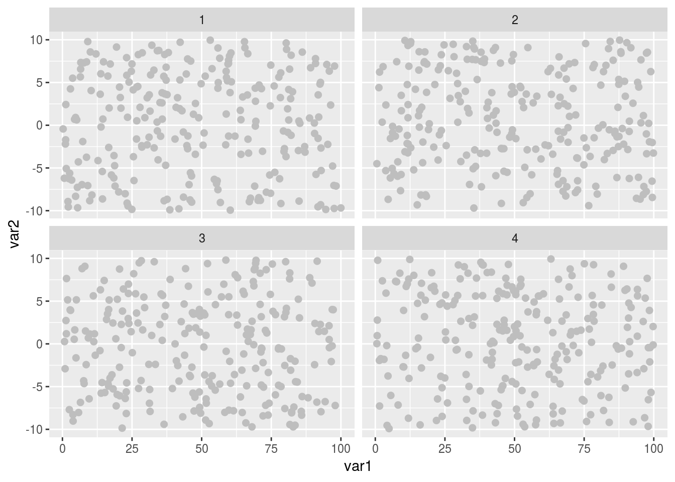
So now the points are a little bigger and grey, which makes them easier to look at and with an aesthetically nicer muted contrast. We’ve also split the data into 4 separate panels, so that we can seen any group specific trends far easier, and without the visual clutter of lots of different colour points (ideal when there is a monetary cost to publishing color figures). But that grey background is now obscuring things, and our axis labels are still hard to read and uninformative. Let’s fix those.
ggplot(myData, aes(x = var1, y = var2)) +
  geom_point(size = 2, color = "grey") +
  facet_wrap(~catVar) +
  labs(x = "Variable 1", y = "Variable 2") +
  theme_bw()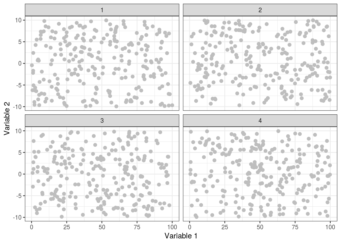
We’re starting to look quite good now, the points are now much more visible, yet not too harsh against the white background, and our axis labels now tell us something about the data (if it were real!). Now we can apply some final polish to really get this looking great!
finalPlot <- ggplot(myData, aes(x = var1, y = var2)) +
  geom_point(size = 2, color = "grey") +
  facet_wrap(~catVar) +
  labs(x = "Variable 1", y = "Variable 2") +
  theme_bw() +
  theme(axis.text = element_text(size = 16),
    axis.title = element_text(size = 18),
    strip.text.x = element_text(size = 16),
    panel.grid.major = element_blank())
Done! The text around the plot is now much easier to see, and we’ve removed the major gridlines which means less distraction from the data. Everything is far clearer and easier to read.
plot1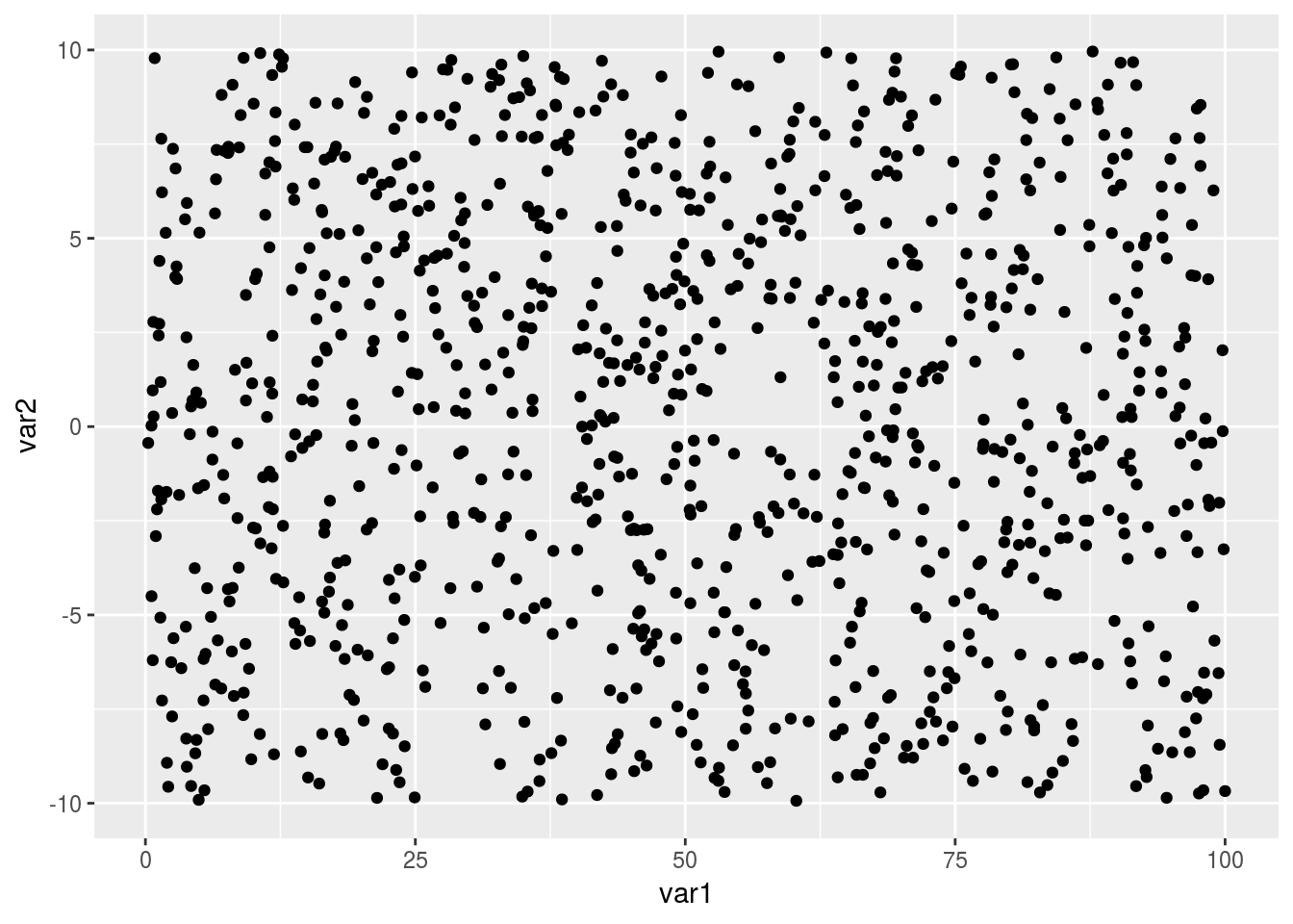
finalPlot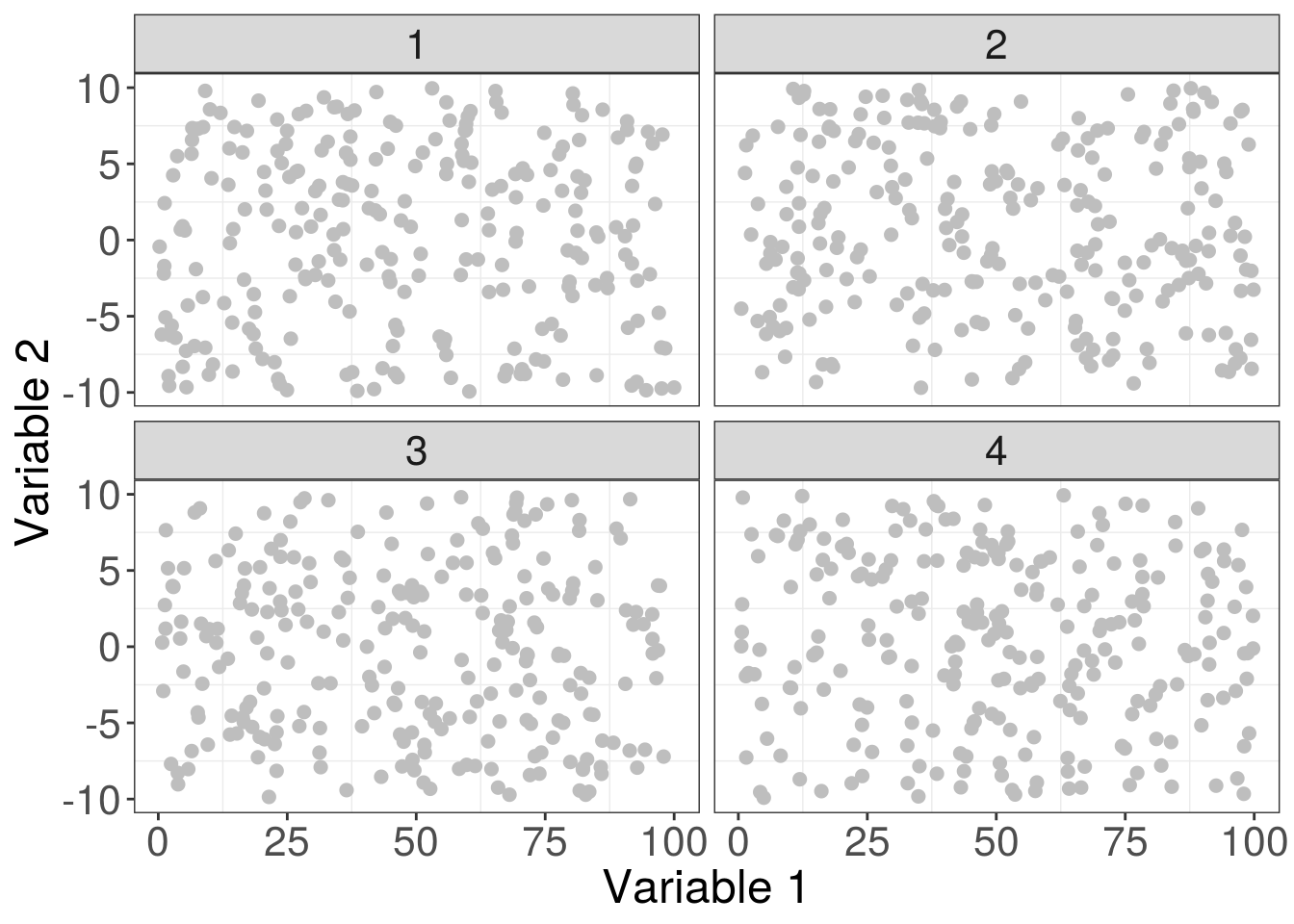
One final tip, save your graphs as pdfs. PDFs are known as vector based graphics and maintain resolution far better than bitmap based graphics such as PNGs, JPEGs or TIFs. The added bonus is that many journals also request your figures to be in a vector based format, so you’re also helping your figures become published.
ggsave("myPlot.pdf", finalPlot, width = 8, height = 8, device = "pdf")